
from Paul Lukas of ESPN,
Don't look now, people, but the start of the hockey season is upon us, which means it's time for Uni Watch's NHL season preview column. With the puck set to drop on the 2014-15 campaign on Oct. 8, here's our annual team-by-team rundown of this season's uniform and logo changes (teams not listed here have not announced any changes):
• Good move by the Ducks, who've scrapped the chest wordmark on their home and road jerseys and replaced it with their web-foot logo. The new black home jersey is extremely similar to last year's alternate, with some minor differences in the trim on the collar, uni numbers, and player name lettering.
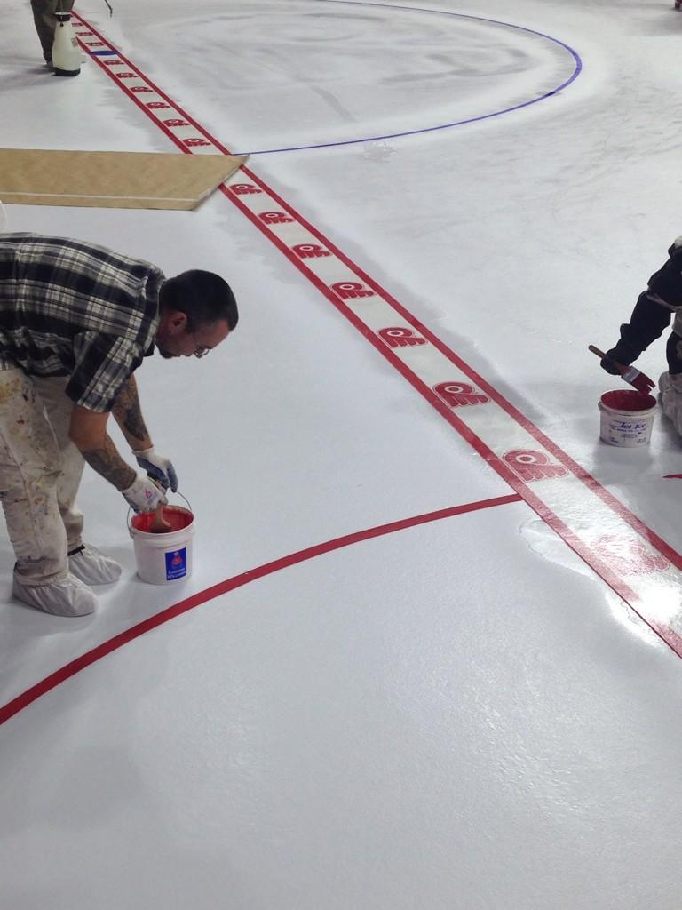
• Remember the uni that the Flyers wore for the 2012 Winter Classic? That design is now their official alternate uni and will be worn 12 times this season. It's not a bad look, but it's too similar to the Philly's home design. Meanwhile: In a very cool move, the Flyers are now embedding their primary logo in their red line design.
• It's an annual rite of autumn: Red Wings fans freak out when they see the team's block-lettered nameplates during the preseason. Don't worry, people -- the vertically arched letteringwill return when the regular season starts. Meanwhile, here's a more subtle change: The Wings' helmet wordmark lettering has changed from solid to outlined.
Create an Account
In order to leave a comment, please create an account.